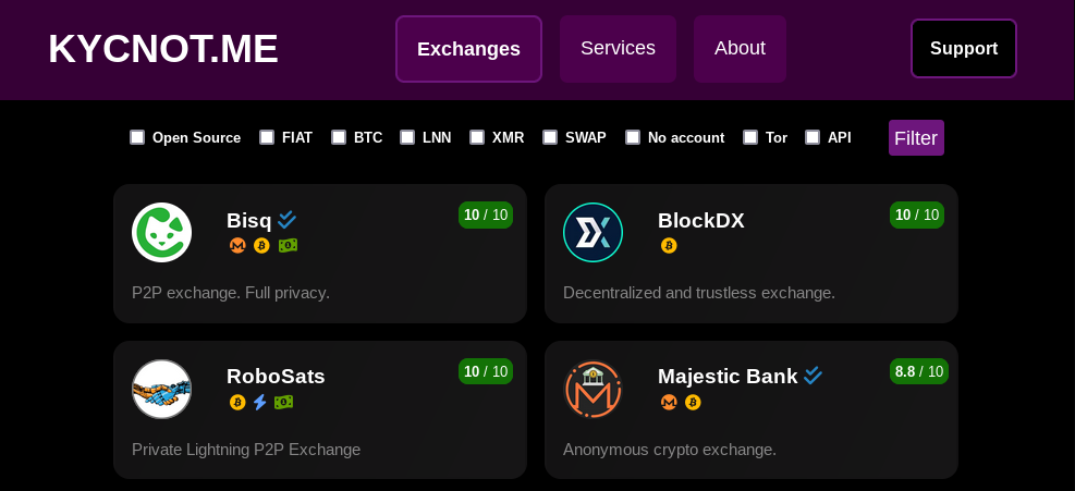
pluja unveils new and improved KYCNOT.me dark themed UI

pluja1 has unveiled2 a new and improved dark themed user interface3 for KYC? Not me!4, looking for feedback from the Monero community:
Hey everyone. Lately I’ve been working on a new UI for KYCNOT.me [..] I want to get some feedback before switching this UI to the main site. Note that it may still contain some bugs!
Changes
Revamped dark-themed UI
You can now apply filters
Improved service info page
Improved overall performance
Show status of the service
Improved automated checks
The source code for the project is available on Codeberg5. The new UI code can be accessed on the ui-redesign branch6.
The project maintainer has previously rewritten7 the website and added new functionality in September 2021.
pluja has also created ISeeYour.cash8 and attempted to fund the Moneroj.info9 project throught Monero’s CCS, but decided against it10 in the end.